Alone

AS Film Opening
Showing posts with label Research. Show all posts
Showing posts with label Research. Show all posts
Tuesday, 3 December 2013
Music Research
To research sound I looked at similar films and how they used sound in different scenes. I looked at some of our inspirations such as I am Legend. In I am Legend there isn't much music because the silence is used to show how alone and isolated the character is. A lot of similar films also use silence and the sound of nature to convey that there are no more humans.
I then looked at theme songs for our inspirations and found that they create a very eerie and sounds like slow realisation as the music builds up. In the theme for 28 days later the music builds up and gets more intense. I think we should use something similar as Maddie will get clues of her situation as the beginning of the film progresses. I think this will help the audience understand what Maddie is feeling without her saying anything. We will need to find some similar music to this that is not copyrighted.
I think we could use sound effects to give the feeling of isolation and loneliness. I think using sounds of nature such as birds will create the atmosphere that we want. Putting more emphasis on the sounds Maddie makes will make the audience aware of the silence and make the atmosphere very eerie.

Wednesday, 27 November 2013
Our Insparations - The Walking Dead
We chose to analyse this film opening as it is similar to what we want to do and has similar themes. It has the theme of loneliness which is a big part of our film opening. I'm going to focus on the titles as they are presented quite well in this.
The font used is very bold and is in capitals which makes it stand out. All of the titles appear in front of a scene of a deserted place. There are pictures of the cast and their names appear when they are on screen. This is a good way to show people which actor/actress is who. The title appears in front of a black background so it stands out and informs people of the title. some titles fade out and others move across the screen until the shot changes. The shots are always moving and the transitions and fast and build tension. The music also builds a lot of suspense and tension.
The scenes feel deserted because there is no one there and everything is dirty and broken. We aren't going to make our scenes look like this. Our scenes are going to look like a town that is lived in except that no one is there. This will be mysterous and people won't think it's a zombie film.
Monday, 18 November 2013
Our Inspirations - I Am Legend
'I am Legend' is a film about a man living in an abandoned city because of a zombie apocalypse.
When watching this film we noticed how similar in some ways it is to our opening film sequence. At the very start of 'I am Legend' we notice the camera angles are very wide to show the grand scale of the city and how empty the streets of New York are because of the zombie Apocalypse. They've also done various birds eye views of the empty city. Noticeably they've put the titles on top of buildings and on streets to make it look like its included in the surroundings.
Our Insparations - 28 Days Later
28 days later is a film about a man that was in a comma and he wakes up to find it is the end of the world and everyone has turned into zombies.
When watching the trailer we saw that the man was all alone in London and it was what used to be a crowded street. This is the look and feeling we want to put across in our film. I really liked how that the phones were swinging from their cord as it shows that there is no one around to help in person or over the phone. This is the similarity between the two films. I really like the costumes that they have used as they fit the genre well. As he wakes up in hospital he leaves with only his hospital gown. We would like to recreate the scale that they have done in this film but we realise that it will be extremely hard. We did not want our film to be in the dark as it would be to cliché. We really like how fear is created even though the lighting does not fit in with the feelings. This is another reason why this film inspired us to film one like it. There are very little props in the trailer and we think that we would change that. We will show televisions and mobile phones to show the time that the film is set in. We have decided to do this so the film will seem more realistic to a young teenage girl of the present day.
Friday, 15 November 2013
Wednesday, 13 November 2013
Monday, 11 November 2013
Alone Feedback From the Class
After pitching our film to the class, we were given some feedback on how we could improve our film further. The main point that we had to work on was to not put too much into the short opening. We were given ideas of how we could condense all of the important scenes into one. We will use fades and small flashbacks to show previous activities of the night before. We will also use two layers and have two different shots other each other so it looks like she is remembering her family.
Alone Film Pitch
Here is the film that we pitched to the class. Megan came up with the initial idea but we then spent a lesson perfecting it and improving the pitch.
Sunday, 3 November 2013
Individual Film Pitch The Lost
Here is my Prezi for an idea I came up with to create for my groups overall opening. My idea was not chosen as we thought it would be hard to film and to get hold of all of the props to make it look realistic. Also as there is only three of us, it would be hard to get all of the characters in shot without asking others if they would like to participate.
Friday, 1 November 2013
Art of the Title
1. What is the definition of a Title Sequence?
A title sequence is a way that films and television programmes present their title. They are normally visual and colourful to attract your attention and they normally show the cast and the name of the film or programme.
2. What is the function of a Title Sequence?
The function of a title sequence is to help the audience understand the genre of the film and what it is about. It also needs to intrigue the audience so that they will watch the film of television programme.
3. Name three films featured in the A Brief History of the Art of the Title Sequence?
The three film titles that stood out to me were: 'Star Wars' 'Casino Royale' and The Pink Panther'
4. Select a film Title Sequence shown in the A Brief History of the Art of the Title Sequence and discuss how the Title Sequence uses Typography Elements (text), Visual Imagery/Sound Elements and what kind of mood/feeling is created as a result? Name of chosen Film Title Sequence: Use of Typography Elements (text): Use of Visual Imagery/Sound Elements: Mood/feeling:
When I watched 'A Brief History of the Art of the Title' I saw the Casino Royale opening introduction. The introduction is very good. As the film revolves around poker, the into has lots of references to a pack of cards and the four suits. The movement is clean and looks really good. The choice of song was really important to choose as it sets the mood that the audience are feeling when they are watching the film. The main colours used were red, black and white as they all stand out when together and do not blend together. Even though the characters are in black, white and red you can still tell which one is James. As there are lots of guns and fighting in the titles, it makes the audience realise the genre and feel like it will be an action film as there will be gun fights and car chases.
5. What does the use of Typography Elements (text), Visual Imagery/Sound Elements in the chosen film Title Sequence suggest about the theme/content of the film?
The visuals are mainly in black and red to represent the colours of playing cards. As James Bond's enemy's are red, it represents the blood that is shed when he kills them. The text stands out well and is very clear to read which helps the audience to enjoy the film so that they are not finding it difficult to read the text on the screen. The music suits the film as it relates to guns and saving lives which is shown by the animations on the screen. The animations show the audience clearly what content will be in the film by showing all of the guns and violence and it also portrays the theme of action as there are lots of fight scenes and explosions.
6. Select another film Title Sequence shown in the A Brief History of the Art of the Title Sequence and discuss how the Title Sequence uses Typography Elements (text), Visual Imagery/Sound Elements and what kind of mood/feeling is created as a result? Name of chosen Film Title Sequence: Use of Typography Elements (text): Use of Visual Imagery/Sound Elements: Mood/feeling:
The opening scene to The Pink Panther Has been animated to make it more interesting to the audience. It shows the main characters and portrays the personalities and characteristics of the two characters as the inspector is very clumsy and can be outsmarted easily. The music is easily recognised and is a happy tune. It reflects the film as being funny and happy instead of it being a horror film. The audience feel relaxed when watching the opening as it is funny and there is no reason to be nervous of what is to come.
7. What does the use of Typography Elements (text), Visual Imagery/Sound Elements in the chosen film Title Sequence suggest about the theme/content of the film?
The text is in pink to represent the film and the colour of the diamond. Pink is bright, happy colour and this is subliminally sent to the audience. As the inspector is trying to hunt the panther and he keeps falling over it sends a message to the audience that the film is going to be happy and funny. The soundtrack also helps to send across the message that it is a family friendly film and will be a comedy filled with an inspector being really clumsy.
8. Name of 1st chosen Film Title Sequence created by Richard Morrison:
The Dreamers
9. What does the use of Typography Elements (text), Visual Imagery/Sound Elements in the chosen film Title Sequence suggest about the theme/content of the film? Mood/feeling:
The Dreamers - The typography is done very well. I like how is weaves and appears out of the scaffolding of the buildings. The white stands out over the black, blue and red which is good because it is easily visible to the audience. I liked how the title of the film had letters at different sizes which makes the film a little more original and less boring then just a normal white font that is all the same size. The music used is a cheerful, upbeat tune which sends a message to the audience that it will be a happy film and possibly a musical. When the text finishes, the camera tilts down to show a young man in a suit looking around. The audience are already asking questions like 'who is he?' and 'what is he doing?'.
10. What does Richard Morrison explain about the Film Title Sequence?
Richard Morrison says 'As a creative, I find the idea is always the key and the means to do it is a secondary matter. Because of the nature of The Dreamers — its plot and timing — I wanted this sequence to look organic, just like in the old days. So I just started piecing visually abstract elements together, like in a puzzle, and decided to completely abandon any complex animation effects. It just did not fit in with the essence of the movie.'
11. Does Richard Morrison feel the Film Title Sequence was successful, why or why not?
Richard Morrison thought that the film opening was very successful as he said that you could not just press delete if you did not like something, it all had to be planned in advance. He had a strong belief that the film opening would work and in the end all of his hard work paid off.
12. Name of 2nd chosen Film Title Sequence created by Richard Morrison: What does the use of Typography Elements (text), Visual Imagery/Sound Elements in the chosen film Title Sequence suggest about the theme/content of the film?
Vantage Point - The opening to Vantage Point has lots of bits of film cut up so you cant see the whole of the picture. This is so that the audience are left guessing what is in the rest of the shot instead of them just being shown. When there is the image of the sniper rifle, you can only see the gun. You cannot see what it is pointing at which makes the audience question who is going to be shot. This makes the audience believe that it could be an attempt to assassinate someone.
13. What does Richard Morrison explain about the Film Title Sequence?
Richard Morrison says 'It is an elegant piece. I liked the idea of random elements coming together before our very eyes, and I thought it would be very clever to use the red laser dot as a motif. It immediately introduced the theme of assassination and threat. Also, I think that the dark gold palette of these images strikes a chord with the filters used later to film Salamanca — there was this smooth transition between the titles and the first scenes shot from the helicopter.
The sequence had to be based around the idea of perspectives. So I graphically tried to create a web of intrigue to give viewers an accurate insight into what they can expect in the movie.'
14. Does Richard Morrison feel the Film Title Sequence was successful, why or why not?
Richard Morrison feels the title was successful as he describes it as 'an elegant piece'. It is successful as it gives very little away about the film which keeps the audience interested. He also says that it gives a clear message of the themes to the audience.
Wednesday, 23 October 2013
A Day in the Life AS Media Marking
I chose to mark 'A Day in the Life' as the text on the image above made me think that they had put lots of effort into their film. I liked the way that the text was placed in different areas and I also liked the way they made the mirror show differently to what was actually happening. I found the bit when he left the house a bit long and boring but otherwise good. I would score this a level 4 and would give it 52 marks.
The Run AS Media Marking
I chose to look at 'The Run' because the title intrigued me into watching it. I liked the way they used the school science lab as a set. I also liked the way he had a Bunsen burner going in the background to make it seem more realistic and make you realise that you are in a science lab. I also liked the way that they ran through the estate jumping from railings and over walls. I would give this a level 4 as I thought it was really good and imaginative. I would score it 50 as there are some areas to be improved, for example the voices were a little quiet.
Thursday, 17 October 2013
Iron Man Opening Analysis
Camera
The first camera shots starts inside an army convoy. It is a shot that is looking through Tony Starks eyes. We can see what he is seeing when he is being escorted through an area. Most of the shots are close ups and medium long shots. This given the impression that there are cramped in the car and there is not much room to move. When the car in front blows up there are lots of quick cuts and changing of camera angles. This shows that how quickly an attack can happen and that if you are not ready you will most probably not survive.
Mise En Scene
The setting is in an open space inside and army truck. They used props such as a camera, guns and a explosive rocket. The colours are mainly the same colour of the army camouflage so that they blend in. At the end of the opening, Tony has lots of cuts all over his face. This make up would have taken hours to prepare. The sound is all diegetic as we can only hear the explosions and talking that Tony can hear.
Sound
The sound is all diegetic as we can only hear what Tony can here. As tony gets hit by the rocket the sound slowly fades out making him feel alone as he is in the middle of nowhere and his bleeding heavily.
Editing
The opening of the film mainly has straight cuts. When the rocket hits Tony, all the sound fades out so you can only hear him breathing. The camera then zooms and fades out taking us to another location. I thought that this was really good because all of the straight cuts were fast as that pace to show the explosions but when he gets hit, the camera slows down to show that he is dying slowly and we don't know if he will live.
Friday, 11 October 2013
Toy Story 3 Opening Analysis
Camera
The first shot is a crane shot that swoops through some rocks and onto the train. There are a lot of close ups of faces and there are also some long shots like when the train falls off the bridge and when Buzz Saves the train. There is also a zoom in on the TNT on the bridge. When the Spaceship comes over the canyon, the camera moves up into the eye of the pig and then into the control section. I thought this was a good idea instead of just having a straight cut.
Mise En Scene
The setting for the first scene is Andy playing with his toys, although the audience does not know this yet. It is Andy's story brought to life. It is set in a large canyon with a western theme. They seem to be the only people around for miles. The opening has lots of bright colours. This emphasises how happy Andy is in his room playing with his toys. The characters have a few props like whips and eye patches.
Sound
In the opening there are both diegetic and non diegetic sounds. We can hear the train and the characters talking but we can also hear music to help emphasise the train scene and when the train falls off the bridge. This helps the viewer to feel the correct emotion from the music.
Editing
As the film was made by computer most of it was edited but items like the force field and the explosion from the TNT on the bridge were over exaggerated to seem like a bigger disaster. Also when Jessie calls Rex, the ground shakes and opens to let him out of the ground.
Saving Private Ryan Opening Analysis
Camera
The first shot shows the soldiers in their boats heading towards land to fight. The camera moves up and down when showing the outside of the boat as if you was looking across from another boat. The camera moves along with the waves to make you feel as if your in the boat opposite. The camera then starts at the back of the boat and zooms out to the front showing all of the characters on board. This close up shot shows the expressions on the faces of the soldiers and how they are reacting to the situation. For example two people throw up and the shot zooms out. When the leaders start talking you see that as if you are stood next to the speaker. When the boats hit land, the camera moves up to behind a German turret. From this shot you can see the amount of boats coming in and the size of the beach and how very little spaces there are for the troops to hide from gun fire.
Mise En Scene
From the first shot we can tell that this film is about war. When the boats are sailing towards the beach you can see the traditional green camouflage and army helmets. You can also see a few weapons. The scared expression of some of the soldiers faces also help you to understand the situation. The colours are dark, the dark green colour of the uniform and the shadowy boats block out most of the light in the boat. This gives a nervous and sad feeling to the viewer. As the film starts the date is shown, this is to show the audience when and where the film is set. This date was a significant date to World War 2 as it was D-Day. The props used were mainly guns but before the soldiers hit land you see a few of the soldiers pull out crosses and pray.
Sound
As the film starts all you can hear is the sea and the waves crashing on the beach. This makes you feel alone as there is no one on the screen and you seem to be on a deserted beach. Like with the camera shots, we have the sound of what the soldiers can hear on the boat. This is called diegetic sound. This carry's on through the whole of the opening with the sergeant shouting and the gun fire.
Editing
The film switches from shot to shot with a straight cut. There are no fancy transitions which shows this film is serious and to the point. The shots change quickly as in war, anything can happen that can change the outcome of who wins.
Thursday, 10 October 2013
Peer Analysis of Juno
Group
|
How was the use of camera shots?
|
Use of editing?
|
Use of lighting?
|
Overall success of video
|
Emma Rolfe
James Clifford
Becky Stanway
|
When filming the opening, the camera was quite shaky. Most of the
shots were good and looked the same.
|
|||
Dom
Punt
Lara Eardley
|
Some shots were not in the film. The filming was also quite shaky. First shot was very shaky.
|
|||
George Brewer
Katilyn Jarvis
Sarah
Marez
|
Looked very good and very little movement of the camera. I liked how you used Katilyn as the runners.
|
|||
James Braddy
Megan Larner
|
Not very shaky which is good as it looked better.
|
Friday, 4 October 2013
Camera and Angle Shots
In class we looked at the different types of camera angles and shots that are used in films. Here are a few of them with their abbreviations.

Pan Shot
This shot would be used when setting the scene and showing the area where the scene is being in.
Crane Shot
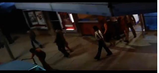
This shot would be used to do shots that sweep through city's or move up a wall.

High Angle Shot
This is a shot from a high angle, you would use this to look down on people or to create the effect of lonelyness.

Low Angle Shot
A low angle shot would be used to make characters seem bigger, stronger and more powerful.
A low angle shot would be used to make characters seem bigger, stronger and more powerful.
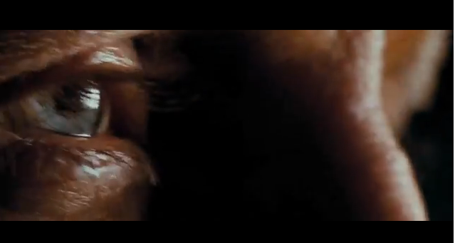
Extreme Close Up (ECU)
This shot is used to see small detail such as an eye or small text.

Close Up (CU)
This shot is used to show details on a characters face and to show their expressions.

Medium Long Shot (MLS)
This shot is used to show most of the character, normally from above the knee.

Long Shot (LS)
A long shot is used to show the whole of the character and some of the scenery around him or her.

Extreme Long Shot (ELS)
An extreme long shot is normally used to show the surrounds around the character. It can set the scene.

Over the Sholder Shot (OSS)
An over the shoulder shot is used when you look over the shoulder of a character. Used mainly in dialouge.

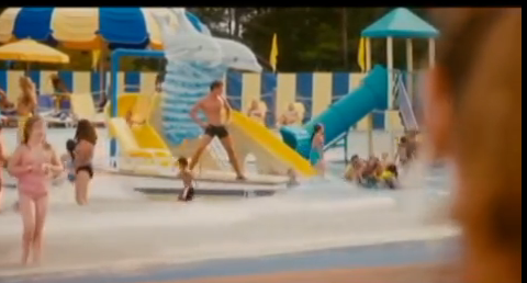
A two shot is when you have two characters in the same shot. This is normally when they are talking. You can also have a three shot, four shot etc...
Friday, 27 September 2013
Juno Opening Scene
By producing this video, I learnt a lot more about Adobe Premiere and how to film with a handheld camera. I learnt how to use more transitions and effects. I really enjoyed filming and editing our Juno opening. By using premiere I found out some useful effects. I found out how to make the picture have a cartoon look and how to dissolve an image over the top of another. The things that went well when we were editing were the transitions across from one clip to another and also we could get the timings correct. There was a few improvements to be made. We need to over shoot a little more so we have more footage to edit and also we could have used something to put the camera on as in some points it was a little shaky.
Learning to use Adobe Premiere
Here is my music video that I made on Premiere to learn how to use the software and how to export and upload to YouTube. We were given the task to make a music video with some videos and soundtracks already given to us.
Subscribe to:
Posts (Atom)